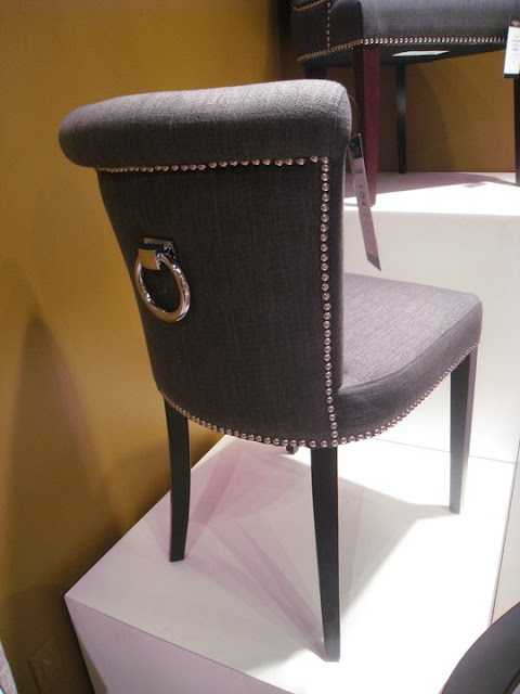
Yellow + black + gray have been a strong chord in our color repertoire for the past few years. It's even gone main stream, taking the place of the pale blue + chocolate brown combo seen in practically every catalog for the past several years. While I think the latter is stale and needs to be relegated to a baby boy's rooms and polka-dots ...and only when you must,

I think the y+b+g trinity has held its own because it's strong, graphic, classic, a-sexual, a-age..ual. It feels modern without out the chill. It complements architectural features, and in some cases creates some where there is none.

This all coming from someone who ranks yellow, low on a their favorite colors list. I'm sure one day, as with all trends, the triumvirate will be thrown into the bushel with avocado and gold and will no longer seem as current.

But you have to admit, even in nature, this palette is reads fresh and harmonious.
(This little tangent was inspired by these beautiful photos and food shoot by stylist, dietlind wolf and photographer julia hoersch. )
By the way, Dietland Wolf's blog is a total time-suck - in the best way a good blog knows how to be. If you like food and beautiful photography, you're gonna get yanked in so deep. Warning you. Just so you know.


Comments
Wish we had a design time capsule to put predictions into - like the answer to, "When will yellow black and grey be over?"
I think it is so fresh that it may be like black and white...it will always have a place.
Cheers!
If you want some swedish decor inspiration, you can check out my blog:)
Have a great week.
LOVE Maria at inredningsvis.se
(Sweden)